Essentials Storefront 2.0
Essentials Storefront 2.0 (S2.0 in this document) is now the default storefront setting for Essentials. It has many advantages over the legacy (storefront 1.0) version. This document will go through the differences and how to set them up.
Topics included in this article
Differences
Let’s start with some highlights so you can see what’s included in the storefront and also what’s possible that you can control!
Navigation
The main difference you will experience will be in the menu structure. S2.0 utilizes a more modern, horizontal menu layout common on most websites, with dropdown menus for various categories and subcategories.
S2.0 has four levels of navigation, whereas the legacy version only had two, with categories and tags. The navigation is not managed on the inventory page but within the Front-End Custom Menu page, which is where a lot of the new “magic” happens.
Branding
S2.0 has more options to control the branding of the customer's site. We split the header bar into a header and navigation (nav) bar to allow for a two-tone colorization.
We added another logo input that allows the user to add a logo designed to be displayed on a colored background.
We streamlined (put guard rails) on text and icon colors to make them either white or black, with automation based on the background color. This streamlines the setup and ensures your Accessibility ratings are the highest possible.
We added a favicon (the little icon representing your brand in the tab menu) entry to customize the icon associated with the site.
We added three sizes of sliders (with three transition options) and images to the homepage and category headers so you can customize your site. It’s not just “supported,” but do-able by users with no HTML or CSS experience.
We added a category grid display to the homepage where you can highlight your best-selling categories. This makes it easy to change categories and adjust things for seasonality, like taking out Lawn and Garden and putting in Snow Removal if you are in a northern tier. Select a category, and the images appear.
We also added the capability to create groups or collections of products. These groups of items could be a category for new items, a particular event, or even storm cleanup. Storefront 2.0 has the power to work, promote and do business the way you do it. The possibilities are endless.
Page Layout
S2.0 has a newer design for the page layout, with images on the left and product details on the right. This makes it so the user doesn’t have to scroll to see rates and the Add to Cart button.
Images are larger than in the old Product Detail Page (PDP). We now show images at 660 pixels square, and they expand to 1000x1000 with the zoom feature.
We added new fields for Features and Uses (available in the legacy version) but more prominently displayed in S2.0.
The suggested items now have mouse-over visibility to images, a short description, and better separation between group names for improved use by rental stores. This one feature is increasing sales by Storefront 2.0 users with significant results! The feature also includes showing variant sizes in a user-friendly way, allowing the customer to make multiple decisions/selections all on one screen.
Cart Functionality
S2.0 has a redesigned cart. The cart now includes the product image and rate, with a much better layout of dates and all pertinent information with a clear path forward to what the user needs to do.
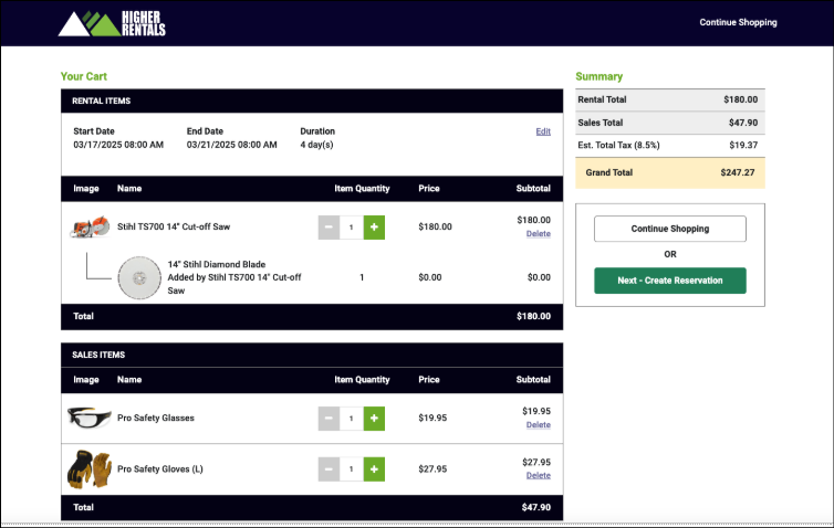
Checkout
Due to customer demand, S2.0 has a redesigned checkout process that is an accordion style, one-page design, providing the user with logical steps to completion, and in the “right rail” a summary of the amounts affecting the transaction details and a list of the items with images. This change has had a tremendous impact on reducing the number of abandoned carts according to our users. It’s also very “familiar,” so users know what to expect, and it leads to a clearer path to payment.
Mobile Friendly
It’s not just friendly, we built S2.0 “mobile first”, understanding that most of our customers would be accessing the site on their mobile devices. We test all screens for mobile use to ensure our customer’s customers (the consumer) have the best experience.
Sales Ready
In the last few focus groups we’ve conducted at the International Conference, we’ve learned that about 70% of our rental customers are also distributors for various tool brands like Stihl, Honda Equipment, Toro, and many others. Our website tools need to be the best at providing rental information and embrace your desire to have one source for all your web needs and uses. We have answered that with Storefront 2.0.
Setup
Setting up or switching to Storefront 2.0 is simple, but it should come with some understanding, and that has been documented in the last section, “Scenarios to Consider,” before making the switch.
Setup to turn on S2.0 can be found on the Configuration tab > Front End Configuration
- Scroll to the bottom.
- Click Save.
- Go to the site and refresh the page.
💡Pro Tip
If the customer has two monitors, have one open to the website and the other open to the configuration section. That way they can make changes on one screen and see them on the other without going back and forth.
ℹ️Important note!
See the notes in the last section of this document entitled Scenarios to Consider about removing any custom CSS in the Themes section before changing over to the new storefront. Custom CSS often interferes with the new look at features of S2.0. It is recommended to remove it and add back parts of it, as needed.
Getting Started with Setup
To explain the site step up in the simplest terms, think of:
- Themes = Colors
- Front End Configuration = Settings
- Front End Custom Menu = Pages
Themes = Colors
So, let’s start with colors, as this is one of the most common steps people take when putting together a website.
As mentioned in the Differences section, we are providing more options for color and branding and fewer simultaneously. The header is now two-tone, so the user can select colors for either the header bar and a different color for the nav bar, or they can make them the same. We are limiting the colors of the text to either white or black, which automatically adjusts based on the background color. We did this to increase all of our customers Accessibility scores as ranked by Google and other third-party sites to ensure our customers that their sites are visible and well functioning to customers with special needs.
Speaking of Accessibility, you MUST click through this warning each time you open the Themes section. It alerts you that what you are doing may affect your accessibility score.
- Click Confirm to close the window.
- From the Theme menu, you can select the edit icon to edit a theme or click the button New Theme to add a new one.
- Select Advanced Mode so you have the full set of controls available.
Note: The settings corresponding to the pages shown in this document are below.
💡Pro Tip
The system allows for the use of 6 colors, however it is our opinion, for optimal site design, we suggest using only three or four colors.
The diagram on the right side of your screen shows how the colors appear on the site.
You can use the left side to enter either RGB or hex numbers to designate colors.
- RGB is formatted with RBG (xxx,xxx,xxx)
- Hex is formatted with #xxxxxx
In the example shown:
- The nav bar and tag colors are the same, but they are shown in RGB and hex formats.
- The header color is the top color.
- The nav bar color is the color corresponding to the color of the navigation bar.
- The Title/Heading color corresponds to the product selected in the breadcrumb on the Product Detail page. (relatively minor in use/impact)
- The Tag Background color is not used within this system currently and can be ignored.
- The Header/Date background button puts a different color behind the date selector in the header bar.
- The Category Text Highlight color is actually now for the call to action or Add To Cart button.
💡Pro Tip
In our opinion, Header/Date background button looks best if set the same as the Header color, but the you can choose that. We also recommend that the Title/Heading color and the Category Text Highlight color be set to the same color.
Make sure you select Front End, as shown below.
- Click Save in the lower right corner. It may take a minute or two to update the pages and the system will say “Saving” in the lower right.
- A “Theme Updated” message will appear at the top of the screen when it is complete.
- Go to the site and refresh the page to see the colors updated.
Front End Configuration = Settings
This section will deal just with the new settings for Storefront 2.0, particularly around logos. Please refer to other documentation regarding dates, availability, overbooking, etc… Those settings have not been adjusted in S2.0.
Logo Entry
There is a new or another option to enter a logo in addition to the old one (which is still located in the Company Configuration > Printing Options), which you would still use for invoice and confirmation screens. The additional logo can be used over colored or dark backgrounds and is found on the Front End Configuration dropdown.
- Click Choose File
- Navigate to the file, select it, and click Open to select it.
- Click Save at the bottom of the page.
- Go to the site and refresh the page to view the logo.
ℹ️Important Note!
If this logo is shown over a dark background a .png graphic MUST be used with a transparent, or no, background! Also note that the entry box for this logo does NOT have a colored background, so it may appear that portions of it are missing (because it’s on white, like the image below shows).
Favicon
The favicon is the little icon that appears in the tab bar on any browser to identify the open application. It also appears in the list of saved URLs on mobile devices. It displays at 16x16 pixels in a browser but is larger when saved for a browser. It must be a .png graphic to work in regular and dark modes. It renders best if the image is square! The one in the example is not square and pixelates a bit when viewed.
- Click Choose File
- Navigate to the file, select it, and click Open to select it.
- Click Save at the bottom of the page.
- Go to the site and refresh the page to view the logo.
Front End Custom Menu = Pages
The biggest changes to site settings and creation are in the Front End Custom Menu (FECM). The FECM is extremely powerful and was underutilized by customers in the legacy version.
The biggest difference is the removal of the “left rail” category navigation and Tag filters.
Some would say the left rail was old and outdated, and the horizontal nav bar is newer and more modern. We do know two things:
-
Many customers overused tags, resulting in left rails that made it hard to find products
-
Controls of the Front End Custom Menu were previously difficult to use, so customers had a hard time setting it up and using it effectively.
So we redesigned it from a user perspective (and we still have more to do), but it is:
-
Powerful
-
Easier to use
-
Comes with automated functions
-
Customizable
We highlighted many of the features at the beginning of this document, and we’ll go through them in detail here so you can set them up.
Navigation
Let’s start with navigation, as this is a very important part of any site. It allows your customers to search and find products in a logical flow. If you haven’t already done so, starting with your data structure and thinking about it from your customer’s perspective is a good idea.
The good news with this storefront is that you can make changes or additions to how things show on the website or storefront without affecting how things are set up on the counter side. This gives you, or your web manager, more control to make customer-focused decisions for product layout.
You can go four levels deep like the first image (used for demo purposes with multiple types or product “catalogs”) or have a simpler layout in practicality, like to the right.
As you can see on the right, with all the dropdown menus collapsed, each line is shown in the site's nav bar.
The lines with a grey background and a folder icon are, in fact, folders with pages nested below. Items can be added to the folder by clicking the + icon and adding a new menu item.
Moving items is as simple as clicking and dragging the six dots on the left to select an item and then dragging it into place.
If we want to move the Generators to the first category displayed, we simply click Generators, hold, and drag it above Automotive Tools, then release.
The Generators category is now in the top position, and a Save button appears in the lower right corner. You must click Save every time you change the menu hierarchy. You may make other changes to the right section of the page, but the menu hierarchy has its own Save button. This hierarchy is so important that we wanted this section to have its save button functionality!
Note: Remember to refresh your site to see the effects!
Managing Categories
When your categories are imported from Elite, it brings in all the categories. Most of them you want to directly import with images and product associations, however there are some that you don’t want. There are two ways to deal with these:
-
Delete them from the Menu List
-
“Blacklist” them with the Manage Storefront Categories button
Deleting a category from the Menu List just deletes it from the visible list (wherever it appears) on the website/storefront to the customer. Internally, it still exists, and you can select those items to add to any menu item you create.
To delete a category from displaying, just click the trash can icon on the line where the name appears.
“Blacklisting,” a category using the Manage Storefront Categories, deletes the category, images, and all items associated with the category. These would be “obvious” categories like Customer Work Order or Labor. You might use these categories internally but would not display on the storefront.
- To blacklist a category click the Manage Storefront Categories in the upper right.
- You can use the pagination to find the category or the search bar to find the category faster.
- Check the box to select the category.
- Then click the Toggle Category Blacklist button.
- This will blacklist/hide/delete all references to the category.
- Use the Quick Filters button and click the Show Disabled filter to see the categories that you have blacklisted.
- To return to the Front End Custom Menu, use the dropdown menu in the upper green bar.
- Refresh the page to see that the category you wanted blacklisted is now gone.
Adding New Menu Items/Pages
There are six options for page types to select when adding a new page.
Click the New Top Level Menu Item button to add any new page, and a menu of options will appear on the right.
-
Menu category = folder
-
Custom content = page
-
Internal link = enter link to a page in the site
-
External link = enter a URL
-
Item Container = select items to display on this page
-
Contact Page = Contact Us page with an entry for the email address of where to send inquiries
Menu Categories
The menu categories from the image above are Rentals, Sales, Resources, and Articles. Each of these menu items has more options below each one.
💡Pro Tip
You can have menu categories within menu categories! This is how you can create easy-to-use navigation for your customers. You could have:
Tools >
Saws >
Table
Miter
Circular
Concrete
Chainsaws
Drills>
The key is to start with what makes the most sense for your customer and then work backward.
Custom Content
As the name implies, this is for custom content. In the example above, Home, About Us, and Delivery are custom content pages.
A page that is designated as the Home Page has additional features available.
Selecting the checkbox (shown in the red rectangle) that this is the Home Page enables the additional features for this page.
The Add Custom Slider is available on Custom Content AND Item Container files. You can add graphics to highlight any and/or all categories. We’ll cover this later.
A popular feature of the Home Page is the category highlighter. This allows you to highlight certain categories that may be best sellers, seasonally relevant, or just need a little extra exposure.
The image above shows what it can look like on the main page.
So let’s set it up!
On a page checked as Home Page, this section is called Category Grid Display.
The first decision is to choose how many boxes you want to appear. The system allows for between 3 and 12 boxes in the grid.
💡Pro Tip
Select 4, 8, or 12, as they are in rows of 4
You can then enter the Section Name. If you enter it here, the text is set in color and size, OR you can enter it in the Content section (and have more control over the size and color of the text).
You can then choose the box's background color behind the category name. We provide options corresponding to your theme selections and automatically select the text color based on the background color to keep your Accessibility score high.
The setting for Box Shadow controls whether the graphic appears inside a box. This gives you greater control over the look and feel of your site. Experiment with turning it on and off to get the look you’re after. Remember to click Save in the lower right corner, then go to your main page and refresh the page to see your changes.
Selecting categories is easy: Just choose from the list of categories, and the graphics associated with each category will appear automatically. You can move categories by selecting them in the order you want them to appear. It’s just that simple!
💡Pro Tip
Use this section to seasonally adjust the categories you want your customers to know about. In the winter, substitute Lawn & Garden with Snow Removal if you live in a northern-tier area. And don’t forget to highlight Propane, as this is many rental stores' best-selling item!
Custom Sliders
Custom Sliders are available on the Home Page and the Item Container section.
If you add only one image, it is static and doesn’t slide. This is very useful for category graphics on product pages.
Customer Sliders come in three sizes (examples below).
-
X-Large - fills the screen top to bottom - great for Home pages
-
Large - fills the screen left to right - 500 pixels high - useful for category headings
-
Banner - edge to edge of the product display area - perfect for category graphics
X-Large
Large
Banner

Slider Dimensions
Banner - 1200 x 236
Large - 1920 x 500 (will display edge to edge - left/right)
X-Large - 1920 x 953 (will display edge to edge - top/bottom)
We will setup this option, including the call to action buttons.

To enable the Custom Slider click the Add Custom Slider button.
The slider options will appear and will default to the Large slider.
Select X-Large since we want to display it on a Home page.
If you have more than one image, you can choose to automatically slide between images. If you don’t select the box, images will have arrows to advance, but users will not typically click them. We recommend selecting a transition between 6-9 seconds for the best effect. You can choose what you like best.
There are three transitions to choose from. Fade is the most popular and fades one image into the next. Slide - slides image to the left. Coverflow is the least used and adds a little animation to the image as it transitions.
The next option is to select an Image or Color as the background. Most will choose an image. The color background puts a block of color in the background, and you can enter the category name to display in the box. The color block is an option, but the image will be used most of the time.
To add an image, click the + box to reveal the image selection dialog. Click Choose File and navigate to the file on your computer.
Click the image.
Click Open to insert the image. A short dialog box will appear while the image is uploading.
You MUST click Done for the image to upload.
ℹ️ Important note!
The image box changes dimensions based on the image size selected. The image will scale to fill the box automatically. If needed/desired you can click the + or - to increase the size of the image.
Next, you can enter the text that will appear on the image. By default, each slide is labeled Slide X. Each image can have its own text and call to action.
You can enter up to two call-to-action buttons with links.
Enter the first by entering the text and the URL. Add a second call to action by clicking the + icon, or delete it by selecting the trash can.
Click Save at the bottom of the page and go to the site. Refresh the page and see your new image.
To add more images click the + next to Slide 1 to repeat the process of adding images, the text and the call to action.
Content
Each custom content page has three sections.
-
Custom Header Content - above the main section
-
Content
-
Footer Header Content - below the main section
You can type in the section using regular text, the text options for formatting, or switch to HTML, which provides ultimate control.
Creating New Categories
As mentioned in the Navigation section, with a storefront, you can add “categories”, collections, or groups of products. These can be:
-
items or brands that are New
-
Specials
-
Holiday promotions - 4th of July, Labor Day, etc…
-
Projects
-
Weather-related events
Setting up the Storm Cleanup example.
|
In the Front End Custom Menu menu,
| |
| |
|
In this example, we are looking for specific items, such as industrial saws, generators, safety goggles, and gloves. With the page zoomed out so you can see the full effect, here is the result.
Use the search box to type in brand names, item names, to any identifier to find the items you want to add.
Click the box on the left to select items.

💡Pro Tip
In the above example you can go even further with integration between rental and sales items. With the storm cleanup use case in mind, you can link sales items from the rental pages. You might be out of them for rent, but you may have stock of them for sale. You can link to either a corresponding model or the category of items for sale.
Variants
As mentioned in the highlights section, one of the most impressive features of S2.0 is the new handling of suggested items. This is leading to significant increases in quote/reservation size for customers who use it well.
A key consideration in setting up your items is to look at the “lowest level SKU” and understand the best way to set it up.
💡Pro Tip
If any of your items come in sizes or colors, set them up as a variant! Safety gloves are a great example. However, variants need to all be the same cost or rate. If they are not the same, it would be better to set them up as independent associated items.
The power of variants can be combined with suggested items where the user can click on the suggested item and then select the size and/or color variant. In the example, on one screen, the user can select waders (including sizes), boots (including sizes), and other accessories in a fly rod package. Previously, this was done on several screens.
💡Pro Tip
Think outside the box for suggested item “category” headers. You can go bare minimum in the header titles,, or think like a consumer, or a guide, and guide your customer through the rental experience and recommend items that they may not know they need/want to use.
For sanders, for example, recommend the sand paper that fits that sander, and gloves, glasses and masks.
To set up variants, just click the Variant tab at the top of the Inventory screen and add your variants. Then in the Suggested/Related Items tab add your suggested items and add the group label. It’s that simple!
Scenarios to consider before switching to Storefront 2.0
Customers using a sub-domain
Customers with a sub-domain are where your site may be built with WordPress e.g. the site resides at HigherRentals.com (HigherRentals is a fictitious site and will be used as an example throughout our documentation) and when you click on the Rentals tab in your navigation it takes you to higherrentals.pointofrentalcloud.com
Issues: No problem using Storefront 2.0 quickly
Considerations: Might need to spend a little time modifying Category navigation with the Front End Custom Menu configuration, switching from the left rail navigation to the horizontal navigation
Custom CSS: We recommend you copy and save your custom CSS, if you have any, to a separate file and start clean with the new interface and add as needed
Estimated Set Up Time: 10-30 minutes
Risk: very low
Category Sites
Many Essentials customers are set up where the product category image page is their home page. Typically, these types of sites also use the domain.pointofrentalcloud.com web address.
Issues: No problem using Storefront 2.0 quickly
Considerations: Might need to spend a little time modifying Category navigation with the Front End Custom Menu configuration, switching from the left rail navigation to the horizontal navigation
Custom CSS: Most of these sites do not have custom CSS. If you do, we recommend copying and saving and starting fresh without it, and adding as needed.
Estimated Set Up Time: 10-30 minutes
Risk: very low
Embedded Sites
Customers using Essentials with an embedded site may experience some issues switching to Storefront 2.0. We have taken great care to provide the very best layouts and user experience for both desktop and mobile. However, it will be different from what you have already integrated, so your iFrame will need to be adjusted to work with the new web structure.
Issues: You may encounter issues as you transition to the new format. It is doable, but it does take some time. We recommend doing this during a non-peak business time.
Considerations: Google’s support of iFrame is limited in time (currently, Google is quoting changing/sunsetting support in early 2026) so it might be wise to consider other options. We recommend de-embedding and using our customization options to provide a seamless experience between a general marketing page and the storefront.
Custom CSS: We recommend you copy and save your custom CSS, if you have any, to a separate file and start clean with the new interface and add as needed
Estimated Set Up Time: 1 - 3 days
Risk: medium - high
Full Sites - Custom or Self-Supporting
Customers wanting, or with, a full site, either self-supporting or custom (we build it for you) will enjoy the full power of Storefront 2.0. From custom menus and homepages, you’ll have Essentials' power and ease of use at your fingertips.
Issues: None
Considerations: We are building more tools for you to self-service your site, or we can build it for you. Please contact support if you are interested in Point of Rental building a custom website.
Custom CSS: Little to none is needed to have a dynamic, powerful eCommerce site
Estimated Set Up Time: 4 - 14 days for a custom website. You can work at your own pace for self-supporting
Risk: Extremely low
FAQ
Can I still use tags in Storefront 2.0?
Tags are being phased out. Use filters powered by accurate product spec data for product discovery.
Do branding guardrails limit customization?
Guardrails preserve contrast and readability while still allowing you to choose brand colors.
How can I safely preview changes?
Use the demo site to test navigation, product pages, cart, and checkout before applying changes live.
What if URLs break after migration?
Verify your redirect mappings and confirm DNS automation is complete. Test critical paths immediately after launch and correct any broken links.